The next title in our sequence – barmy occult thriller Don’t Go Near the Park – doesn’t appear here, as it features a slapdash photographic sleeve only (like its Intervision-partner Frozen Scream credited as being “Designed by Morris Associates” – whoever the hell they were. Given their utterly pedestrian work, I can’t say I’m in any great hurry to find out). This is in fact a bit of a shame, as – getting past its unpromisingly generic title – DGNTP is actually one of the more entertainingly original films on the DPP list and deserved better promotion.

Another piece of original British art from Derann, apparently by the same illustrator as Deep River Savages. Our next title, Driller Killer, is also omitted as a solely photographic design, though – given its historical importance – has already appeared in the Introduction. A further point worth noting is that DK’s original US video-release (on Charles Band’s Wizard label) features a near-identical sleeve to Vipco’s and ALSO appeared in 1982. So which came first? We can’t be sure, as the precise date of the Wizard tape seems uncertain. However it would have had to be VERY early to beat Vipco in Feb ’82, so we can probably feel confident this prestigious achievement belongs to Britain. Hurrah!


Palace’s wraparound sleeve for The Evil Dead (adapted from the simultaneous quad poster) arguably ranks as THE classic piece of Nasty design, electrifying a generation of fans and transforming its youthful creator Graham Humphreys into a Brand Name genre-artist in his own right. Born in Gloucester in 1960, Humphreys studied graphic design at Salisbury College of Art before arriving in London in 1980 to begin a freelance career in film publicity, latterly specialising almost exclusively in Horror subjects. His prolific output has been enthusiastically documented elsewhere, and the only real surprise is that Evil Dead represents his sole original Nasty (an earlier quad for The Funhouse disappointingly wasn’t used on the subsequent video sleeve).

Evilspeak is an effective crop from the US theatrical one-sheet by CW Taylor, eliminating the glowing demon-eyes of the original to zoom in on our hero’s vertiginous keyboard-revenge (and also taking the opportunity to replace the rather flabby US tagline with a much snappier UK one). Illustrator Taylor (the W is short for Winston, the C appears a complete mystery) earned two Bronze Stars in Vietnam prior to graduating from the Art Center College of Design in LA, and thereafter spent the 70s-80s churning out a stream of (mostly excellent) pulp artwork for US films and publishing, later achieving cult success illustrating a series of Quantum Leap comic-books – the above pic is from a 1992 QL fan-convention.

Intervision’s original gatefold-slipcase features a very early photographic design by Graffiti, though both spine and cassette-labels also adapt elements of Sam Peffer’s luxurious quad poster. Expose was not only the first Nasty to appear on video (possibly as far back as 1979), it was also the sole British film on the list (Jorge Grau’s The Living Dead – while largely shot on location in the Peak District – is of course a Spanish/Italian co-production).

Another notorious title, this time adapting frankly grotesque art from the Spanish uno-hoja, though dropping the surrounding montage to focus on its central electric-chair victim.

Another straight adaptation of the original US one-sheet (minus dog-whistle tagline) – note that it hasn’t bothered retouching the incongruous remaining bits of blue background.

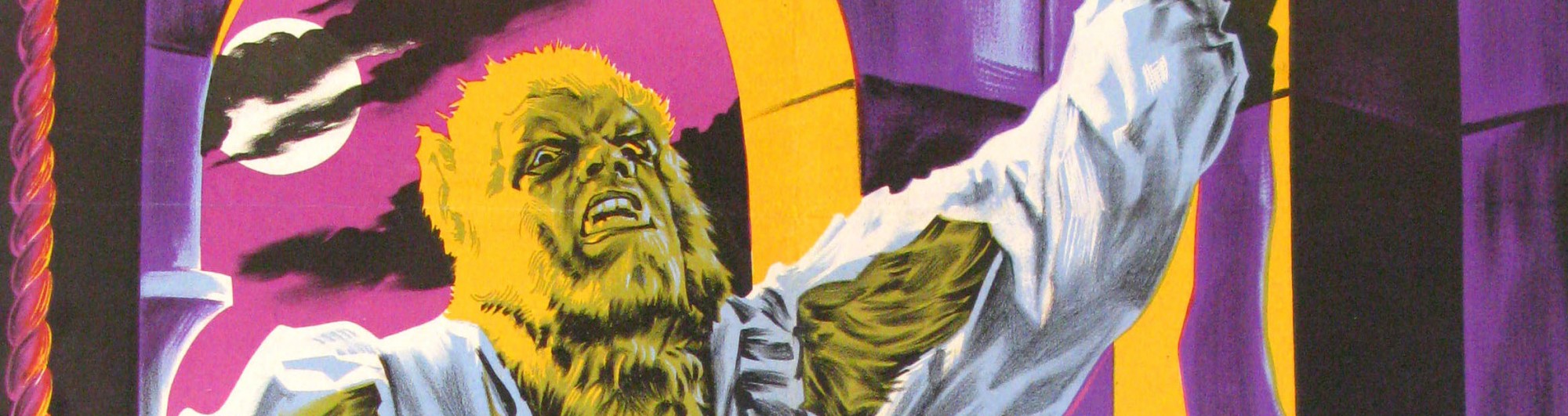
This is really interesting. What we have here is an apparently original British artwork, but (as has been previously pointed out) bearing a striking resemblance to a 1957 Corgi paperback of the same name by a popular German explorer of the time. According to one tongue-in-cheek bookseller synopsis: “…subtitled ‘Orchid Hunting in the Green Hell of the Amazon’, the author describes a sensational expedition through jungles, from the ‘decaying, vice-ridden Amazonian settlement’, through the brooding menace of the forest, pursued by ‘man-hunting Indians and the treacherous masters of slave plantations, capable of incredible tortures’, surviving fever, shrieking storms, wild animals and sundry other privations in pursuit of the treasure of rare orchids, in areas where murderers live by the rule of the knife and buy their pleasure in drink-sodden orgies. A fun read, only a small amount of the book is about orchids” – you have to appreciate that closing warning to any unwary horticulturalists, and the plot sounds like it would make a pretty lively Nasty in itself (Jess Franco would surely have leapt at the rights). It’s all probably just coincidence, but a striking one nonetheless.

Vipco’s sleeve for Andy Warhol’s Frankenstein is a photo-montage only, but Arnaldo Putzu’s classic earlier quad poster (likely based on a design by Feref’s Eddie Paul) is justifiably famous. However – indifferent as Vipco’s clunky sleeve is – it’s STILL preferable to Intervision’s Frozen Scream (the latter, as previously noted, credited to ‘Morris Associates’), which is surely just about THE most drably anodyne Nasty cover of them all.

Again, a straight adaptation of the malevolent US one-sheet, though it’s a pity CIC didn’t use Graham Humphreys’ vastly superior quad artwork (you can lead a horse to water…..)

In terms of our core thesis, this is actually a key image. A whopping SIX of the original Nasty sleeves (Absurd, Anthropophagus Beast, Contamination, Gestapo’s Last Orgy, The Living Dead and Madhouse) carry a credit reading: “Sleeve design by IMPRESSIONS 01-722-3939”. So who were they? Frustratingly, at the moment we just don’t know. None of their contemporaries recall them, and the sleeves concerned (for three different distribs: Medusa, VFP and VIP) cover the very short timeframe of June 1982 – Feb 1983 only. The sole public record of their existence appears to be a single-line entry in the 1983 London Phonebook: “Impressions Graphic Design, 6 Erskine Road NW3, 01-722-3939”. This address (pictured above) is a rambling Victorian piano-factory in Primrose Hill, home over the years to various mixed businesses including letterpress printers and second-hand furniture dealers, all renting what was then undoubtedly cheap / crumbling office-space. In 2014 the complex enjoyed a £12m refurb, so if you’re anxious to secure a luxury two-bed penthouse in tribute to the designers of Gestapo’s Last Orgy, Knight Frank currently have one on the market for £2.5m.
GLO is included here as the sole example of an original Impressions illustration (all their other work is photographic only). Whoever they were, they remain a key part of this story and it is to be hoped more info on their elusive background will emerge in due course.


Time to meet another key contributor. Enzo Sciotti – arguably the last of the great Italian poster illustrators – was born in Rome in 1944, son of a plasterer / fresco-painter who helped decorate local churches and cathedrals, but tragically died young. His son thus urgently needed to earn a living himself, and joined (film-publicity) Studio Battaglia at just 16, later setting up offshoot Studio E2 (with Ezio Tarantelli) in 1975. Sciotti mostly worked in exploitation (ie sex-comedies, action and horror), and in recent years has begun to acquire the inevitable resulting cult reputation – the photo above is from an April 2018 German Horror-Con. Combining often outrageous imagery with the luminous baroque style of masters like Caravaggio / Van Aelst etc, his work will undoubtedly continue to grow in stature
House by the Cemetery is a representative example, as his original Due-Fogli (above) has been completely repainted for the British quad poster, then the result adapted AGAIN for the near-simultaneous video-sleeve. So who re-did the quad? One strong possibility is Tom Chantrell, though the title never came up during our (lengthy) conversations about his horror posters. The video-adaptation is by Graffiti, and later hit problems of its own after Paul and Nimal casually added a smear of blood to the end of Freudstein’s knife. For the (heavily-cut) March 1988 Elephant Video reissue, the newly-established (and still very nervy) VPRC insisted on this being removed again before approving the design.

Again an infamous title, and again a straight (razor) adaptation of the Italian due-fogli, though for once (despite the film’s notoriously extreme content) the latter seems prepared to employ suggestive minimalism only – surely a first for Italian exploitation cinema by this point.

Another unaltered use of the original US one-sheet, though the cheaply silkscreened quad poster arguably has a greater day-glo impact (plus a new, illiterately-oxymoronic tagline). Note the support feature, reduced to an inset title-block – it’s possible Putzu’s previously-discussed Blood Bath artwork was commissioned for this release, but ultimately went unused.

An extremely scarce quad poster, presumably printed in very low numbers for a later-abandoned release (the BBFC never certificated either title at the time). The even blander video sleeve (photographic and hence omitted here) is by Graffiti.

A minimally-adapted US one-sheet (as was typical for Astra) on this notorious revenge-thriller, one of the first tapes to be seized and prosecuted in summer ‘82. The bluntly sexualised depiction of a rape victim is pretty provocative in any context.

Enzo Sciotti’s widely-seen due-fogli artwork was also used on Fox’s video sleeve, but the earlier British quad poster instead uniquely features a dramatic photo-montage from the Feref agency, in all likelihood the work of Eddie Paul.

The video sleeve for Island of Death features an impressively tasteless photo-montage – “The lucky ones got their brains blown out!” – but Sam Peffer’s retitled 1978 quad poster, for a version shorn of 14 entire minutes, sells the result as lushly twisted romance (A Craving for Lust). The next film on the list – Killer Nun – isn’t included here as it’s again a photographic sleeve only (though boasting the memorable tagline: “A thriller full of suspence [sic] based on a true episode of crime that recently occurred in Belgium” – believe that and you’ll believe anything).

Another cautiously restrained Replay sleeve, with another mealy-mouthed Warning on its text-only cover (although – unlike Cannibal Ferox – it at least borrows its famous tagline-graphic from the original US one-sheet).

This artwork (by Tom Chantrell – the top of his cropped signature can JUST be made out at bottom-right)) almost certainly dates from Oppidan’s abandoned July 1976 theatrical release (dropped when the BBFC refused it a certificate). Chantrell (1916-2001) hopefully needs no introduction here: born in Manchester, he moved to London in 1933 and (following Wartime service in Bomb Disposal) worked almost exclusively on film publicity up to his retirement in 1992, being responsible for many of our most famous / iconic posters. The attached photo shows him during his short-lived career as a pirate (with family cat Mitzi).

The Living Dead’s video sleeve isn’t included here, being yet another Impressions photo-montage (though a better-than-average one). Miracle’s striking British quad poster (artist unknown) is in contrast a really cracking piece of cartoon-minimalism for what is surely THE greatest zombie film of the lot, with a smart script and quite stunning use of moody location work in and around the Peak District. So – having generously done our bit for Derbyshire’s tourist industry – we can now bravely proceed to our final eye-popping (ayethangyou) instalment…