Ready for the final disgusting furlong? Good, then let’s begin….

This intriguingly appears to be an original piece of British art (though the swastika title-logo on the spine is taken from the US one-sheet), and features a comparatively low-key design for what was historically the very first (1968) Nazisploitation epic. The next title on our list, Madhouse, isn’t included here as it’s another Impressions photo-montage (and a particularly weak one at that, though it also happens to showcase a tiny pooch – check out Bryce’s earlier book-link if sufficiently interested).


A straight adaptation of the original US one-sheet, incautiously badged by Derann as an “AMERICAN SPLATTER MOVIE” (under the circumstances they may as well have put “Please Ban Me Now”). This is actually a typically professional cheesecake illustration by veteran Missouri pin-up artist Charles Copeland (1924-1979), who moved to New York in 1954 and soon made his name in the burgeoning men’s magazine market: Swank, Bachelor, Male, Stag, For Men Only etc etc. The heroine’s distracted ‘sideways glance’ showcased above was one of his trademarks, and he’d probably be better remembered today if (like colleague Mort Kunstler for example) he’d done more film work – though his appealingly lurid book and magazine covers are beginning to be rediscovered.

Night of the Bloody Apes is another vintage title on the DPP list, its original Mexican version dating back to 1968, though the subsequent US release (which added in all the incongruous gore) was a few years later. Iver’s video-sleeve isn’t included here, being a specially-posed photographic design (a blood-soaked close-up of a scalpel-wielding surgeon), which – combined with the helpful tagline: “Warning – this film contains scenes of extreme and explicit violence” – undoubtedly did all the damage. [The 1974 quad poster above is in contrast a deliciously old-skool double-bill with a distinct ‘50s sensibility]. Iver’s companion offering Night of the Demon doesn’t appear either, as it’s again an original photographic design (this time a moody shot of a stormy night sky), which misleadingly suggests the gormless film in question offers genuine gothic atmosphere (rather than just a sex-mad sasquatch on the rampage).
The next film on the list, Nightmare Maker, once again doesn’t feature here, being a solely photographic design (if an eye-catchingly bloody one). The sleeve intriguingly notes it was “Designed by Len Roberts” – though who he is (or was) is still unclear.

Another infamous title, with the later quad poster being a cheap green/red silkscreen adaptation of the original video sleeve – one of the very few examples of such Reverse Engineering. NIADB is significant for several reasons, the main one being that at its test-case (Old Bailey) trial in Feb 1984 distributor David Grant became the scandal’s sole recipient of a Section Two custodial sentence, getting 18 months (with 12 suspended) for his involvement. Grant’s, um, colourful career as the doyen of 70’s Soho sleaze has been well-documented elsewhere, and appears to have ended in Said, Turkey in 1991 when he permanently disappeared following what is now reliably reported as a contract killing.

VTC’s sleeve for Possession isn’t included here (being another photographic design only), though remains a source of amusement for fans as it was apparently printed back-to-front: the cover blandly features a (very wordy) text-only review (courtesy of Event magazine), while the back boasts a lurid photo of Isabelle Adjani in slimy congress with her octopoid-lover. Tom Chantrell’s superior quad poster, above, is a straight repaint of Polish artist Barbara ‘Basha’ Baranowska’s French original, luridly silkscreened in day-glo pink with a mid-blue overlay – a vivid reminder of the traditional design-skills Tom had been trained in half a century earlier.

Yet another straight adaptation of the US one-sheet, on yet another by-the-numbers teen-slasher.


Prisoner of the Cannibal God is both an increasingly iconic image and a useful nuts-and-bolts example of international adaptation. The Italian due-fogli was painted by Renato Casaro (b.1935 in Treviso), probably the best-known of the surviving ‘golden age’ Italian poster artists. Casaro joined Rome’s celebrated Studio Favalli in 1953 (alongside an equally youthful Renato Fratini) before setting up his own studio three years later. His big break came working for De Laurentiis in 1966 , and he was consistently busy throughout the 70s / 80s, moving to Munich for a brief period before retiring to Marbella, Spain, where he continues to paint classic Hollywood portraits today.
For Cannibal God’s later UK release, Alan Wheatley commissioned Sam Peffer to create two speculative magic-marker Roughs, one a new design and one a straightforward crop of Casaro’s original art (see above) – these were jointly invoiced on 19th Jan 1979 for £100 the pair. The Casaro-adaptation was later selected (it’s undeniably the stronger of the two), with Sam invoicing the resulting retouched (and retitled) paste-up on 22nd Sept for just £14. According to Alan Wheatley’s own job-book, this was printed (by Broomhead Litho) the following month with an initial run of 750 copies. The subsequent Hokushin video-sleeve re-jigs the art yet again, into an even tighter portrait format.

Here’s an interesting example of a cheapskate sequel being promoted via the use of a (lesser-known) poster-image from the original film. ROTBM was cobbled together in 1982 but went straight to video in all territories, meaning there was no existing theatrical publicity to adapt. When VTC belatedly released it here in Feb ’84 (as noted the final Nasty to appear) they simply borrowed Michel Landi’s French Grande art for Spectre (as the original was known in France). Since approx 50% of ROTBM is just recycled stock-footage from the first film, this is arguably less of a con than it might seem (not that the utterly tedious result is worth sitting through under any circumstances). Landi (b.1932 in Fontainbleau) is easily one of the most prolific of the post-war French illustrators. graduating from the School of Applied Arts in Paris before beginning his commercial career designing cinema front-of-house displays. This led (via contacts in the relevant Paris ad-agencies) to poster work from 1964, and like Casaro he was still bashing out striking designs well into the late-80s.

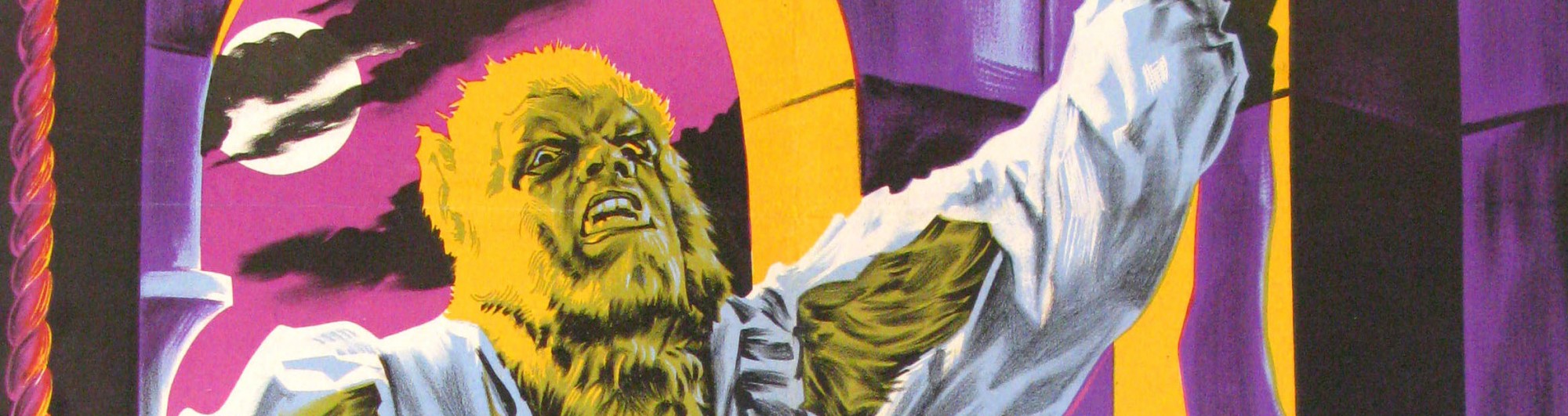
Another straight adaptation of the original US one-sheet for this marginally above-average ‘dream demon’ supernatural-themed slasher.

This one is a bit of a mystery. Probably the most notorious title on the list (despite being regularly debunked as an obvious fake), the (skilfuly-done) art seems to originate from the US theatrical campaign, though – like Beast in Heat – from what precise poster / context is still uncertain. (The more commonly-seen one-sheet is a crude cartoon of a bloodily snipped-up girl’s portrait). Astra licenced this title from Wizard Video in the US, so it’s possible the latter were responsible for the design – though it looks more like professional theater publicity…

The image that effectively started it all. This – as can be seen above – is a minor crop / repaint of the original Italian locandina artwork by Carlo Alessandrini, who habitually signed his work Aller. Virtually nothing is known about Alessandrini – even Italian websites are a blank – though the span of his career appears to roughly mirror that of Sciotti, and he latterly specialised in Nazisploitation, with some of his more extreme illustrations (connoisseurs can search them out if so inclined) contriving to make this one look tasteful / restrained.
Sam Peffer’s adaptation (for Go Video’s Des Dolan) repaints the female figure in more naturalistic flesh-tones, adding a pair of knickers for modesty plus a surreal chained swastika medallion, and replaces the lower line of barbed-wire with an extension of the supporting pole (leaving space for an overlaid title). The general effect is of a pointlessly half-hearted attempt to slightly soften the original. Sam invoiced this on 2nd Dec 1981 for £75 – the lower price (compared with Cannibal Holocaust two months later) indicating it involved less work.

Enzo Sciotti’s characteristically morbid illustration for the Italian due-fogli was adapted twice by Graffiti, first for the theatrical quad poster, then again for the slightly later video-sleeve. Interestingly it’s the quad that’s cautiously censored, replacing the blood-trickle with a scarlet choker (which contrives to make the image even more ghoulishly necrophilic).

Terror Eyes video-sleeve isn’t included here, being yet another (trashy) photographic design only. The minimalist quad poster above is marginally more stylish, but in truth hardly any more appealing. As a Rank campaign it would have been created by the Downton agency, with a likely candidate (given the determinedly literal-minded approach) being John Stockle.

Another straight adaptation of the US one-sheet, also used on the (cheaply-silkscreened) British quad poster. Despite its unpalatable imagery this is actually a skilfully professional piece of work, though the illustrator remains frustratingly anonymous.

This is an intriguing bit of UK design, one of a handful of examples where the video-sleeve actually preceded (and partially inspired) the later quad poster (both from Avatar). Sam Peffer invoiced a pencil rough on 31st May 1983 (for £15), plus a later ‘video disc’ on 14th Oct (for £55), while Alan Wheatley’s job-book records that the quad was designed by Joe Anderson (for £90), then the result pasted-up by Sam (for £30), with the initial May ’83 print-run being a standard 1,000 copies.

Another apparently original piece of British video-sleeve design. The CBS-Fox account was then held by Downton Advertising, but the artist here is unknown (and has supplied a very generic image in any case). The much better double-bill quad poster (featuring a reissue of Escape From New York in support), just uses the (also anonymous) US one-sheet design. The next two titles on the list (The Werewolf and the Yeti / The Witch Who Came From the Sea) don’t appear here, as both are photographic designs only.

A minor mystery on several fronts. Though unmistakeably Sam Peffer artwork, this one doesn’t seem to be recorded in his job-book (at least under its given name). Many of Sam’s entries have random (often apparently invented) titles, and some have no title at all (eg “Demon Priest, Green Head (vedio)” from Aug ’82). Given the timing, this MAY be Dirty Deal (16th March 1982 / £105)… or it may not. Also contentious is the source poster, which is supposedly a US one-sheet, but has a slightly photoshopped look to it. The jury is out.

Following on from Miracle’s earlier success with Zombie Flesh Eaters, Martin Myers quickly acquired another Italian living-dead epic (originally titled Virus), cheekily renamed it Zombie Creeping Flesh and released the result simultaneously to both cinemas and video (the latter via his new label Merlin). The video-sleeve adapts the quad poster, which in turn adapts the Italian due-fogli. The latter is a curious – indeed inadvertently comical – design, with its top-half completely empty barring the prominent (but rather lacklustre) title. The UK version drastically improves this, adding in a pink-hued background-landscape (heavily indebted to ZFE – see below), and completely repainting the female head (so that it looks marginally less hilarious). The artist here is unconfirmed (though likely to be Miracle regular Ted Baldwin – it’s certainly his style), with the slapdash result being a good match for one of the most mindlessly entertaining films on the whole list.


And so we at last reach the end of our sequence, to go out – appropriately enough – with a horrible Bang. Zombie Flesh Eaters is one of the most fondly-regarded titles on the DPP list, and its quite unforgettable video-sleeve / quad poster surely one of the most iconic Nasty images of them all. Tom Beauvais was born in Hampstead in 1932 (son of Arnold Beauvais, himself a noted painter), and joined the Bateman Artists agency in 1949 as Tom Chantrell’s assistant, beginning to illustrate his own posters from 1957, only a year or so after new apprentice John Chapman had arrived. When Chantrell eventually left to freelance in 1972 (and the firm accordingly began to go downhill), the enterprising pair soon departed themselves to form independent design-studio Chapman-Beauvais in 1975, continuing to work for various film business contacts up to Beauvais’s own retirement in 1992.
Chapman-Beauvais’s clients included the likes of Stanley Kubrick, but one of their more memorable characters was apparently Miracle Films’ publicist, a very well-spoken ex-army officer who tended to deliver his briefs as though expounding a clipped strategy to retake El Alamein. He enthusiastically explained the concept of Zombie Flesh Eaters: “Lots of slime, lots of worms, I want to see WOUNDS – open sores, decaying flesh, really disgusting, you know…” Beauvais took a reference-photo of his own clawed hand, and did his best to oblige. The result was so successful Mike Lee later reproduced it (slightly cropped) as a wraparound sleeve for Vipco’s subsequent video release. And the rest, as they say, is history.

Star Video, Hucknall Lane, Bulwell, Notts 1983
So, what are we to finally make of the Nasties? As a genre-category the term is unhelpful, since the 72 films in question are so utterly disparate in style and approach they have little in common beyond being banned, and the present writer’s preference for supernatural horror means only about 22 actually hold much personal appeal to begin with. Of the latter, there are a handful of genuine classics, a few guilty pleasures, and one or two interesting misfires (often without the resources to properly develop their more intriguing ideas). The remainder are often unwatchably bad (ie uninspired / incompetent), and that’s before we even get onto the other 50 which in contrast aim for a broadly realist approach. Other fans may want to defend the endless rape-revenge melodramas, sadistic-psychopath thrillers and Concentration Camp pantomimes making up the rest of the list, but I have no interest in trying to justify these personally. I’m not suggesting a case can’t potentially be made for some (morally and/or aesthetically) but I’d be a very unenthusiastic advocate for them myself.
In terms of their controversial artwork, as already noted it is difficult to generalise. About half were adaptations of pre-existing campaigns, and half original designs. Cultural differences are interesting here: the sleeve which started all the trouble – SS Experiment Camp – was a minimally-altered version of a poster that had caused absolutely no stir whatever in its native Italy six years earlier (amateur sociologists can enjoy contextualising that one). Driller Killer, on the other hand, even today looks so wilfully provocative you can hardly believe Vipco thought they could get away with it. In this sense it, and several of the others, are fascinating artefacts of an aggressive period – now almost forty years behind us – when traditional notions of theoretical ‘good taste’ seemed increasingly redundant. Margaret Thatcher publicly condemned the Nasties, but no doubt privately admired the buccaneering spirit of the go-for-broke entrepreneurs – Mike Lee, Des Dolan, David Grant, Mike Behr and the rest – who first energetically promoted them. Britain’s video boom was a quintessentially Thatcherite phenomenon, and the ensuing scandal an inevitable collision of unrestrained market-forces meeting outraged Victorian morality. It was (lack of) Political Correctness gone mad!

Judith Beheading Holofernes by Caravaggio c.1599
The Nasty sleeves (or about half of them at any rate) really represent the (disgraceful) Last Hurrah of painted film publicity in this country, part of a tradition stretching back to the late Victorian period, but already dying out by the time of the ‘80s video boom. Some of the great names of international post-war illustration worked on these notorious images: Arnaldo Putzu, Sam Peffer, Dario Campanile, Graham Humphreys, CW Taylor, Enzo Sciotti, Tom Chantrell, Charles Copeland, Renato Casaro, Michel Landi, Ted Baldwin, Tom Beauvais, plus many others still to be identified. Is this the scandalous legacy they’d want to be remembered for? Some are no longer around to comment, though both Tom Chantrell and Sam Peffer would undoubtedly have found the notion hilarious. Graham Humphreys has latterly built an entire career churning out this stuff, and maestro Enzo Sciotti is also quietly unapologetic, drawing a clear line between his work and the mystical intensity of C17th religious art. It’s a long way from Caravaggio to Cannibal Ferox, but these lads fought the law – and the Law (briefly) Won.

© Sim Branaghan June – July 2019.
Select Bibliography
Dozens of books covering the Nasties scandal have been published over the last 25 years, all saying more or less the same thing. It is amazing how cross some horror fans can get when temporarily denied the right to watch absolute drivel. At any rate, the following four titles are probably the best of the bunch:
Martin, John Seduction of the Gullible (Procrustes Press 1993) – the first complete history to appear, containing a useful ‘Day By Day’ chronology of events 1982-85
Bryce, Allan The Original Video Nasties (Stray Cat 1998) – containing all 72 sleeves reproduced full-size / colour
Kerekes, David & Slater, David See No Evil (Headpress 2000) – containing a good account of the early market-background (ie video’s emergence from the existing Super-8 scene)
Brewster, Francis & Fenton, Harvey & Morris, Marc Shock! Horror! (FAB Press 2005) – containing a handy DPP-list Timeline, plus solidly-researched info on the distributors
The website www.pre-cert.co.uk also features a cross-referenced / indexed database of early (1979-85) releases, invaluable for exploring specific themes and making connections.