As previously noted, covers featuring basic photo-montages only are not included here (consult Bryce’s earlier book-link for images), which means the sleeves for Absurd and Anthropophagus Beast (both by Impressions, whom we shall meet again shortly) are passed over, and we kick-off with…

The Video Network sleeve for this ramshackle slice of Southern Gothic simply reproduces the US one-sheet in its entirety (including its redundant ‘R for Restricted’ certificate). The Sept 1982 quad poster (by Sam Peffer) is an original design, hastily re-titled to cash in on TCSM (check out the shameless tagline), even though it’s actually set in Carolina. If you’re wondering why the quad didn’t just adapt the one-sheet too, it’s because Tom Chantrell had already borrowed the design for Oppidan’s Nov 1977 release of (totally unrelated) Canadian thriller Cathy’s Curse! Tom never wasted anything if it could save him time…

This one is a minor mystery. There’s no doubt the art is from the Italian theatrical campaign, but in what precise form (and from what precise poster) is still uncertain. The central pic is a recent Italian DVD which appears to feature the original unadapted version, while JVI’s video sleeve adds the swastika, and an old Greek VHS (on right) adds a (nicely-done) battle montage.

Videomedia were associated with Barry Jacobs’ Eagle distributors, and Eagle’s quad poster (centre) only preceded the video release by three months. The quad’s designer is uncertain, but the video sleeve carries a credit for ‘Satori Graphics’, ie Andie Airfix (1946-2018), who later went on to make his name designing rock & pop LP covers. There’s some brief footage of a 2016 interview with him (tagged ‘legendary album cover designer’) on YouTube.

This is another minor mystery – apparently an original UK design from the great Arnaldo Putzu (1927-2012). Putzu started out painting film posters in his native Rome before being brought over to England in 1967 (by Eric Pulford) to work solidly in British film publicity for 18 years until his return home in 1985 – his career (along with all the other illustrators discussed here) is covered in more detail in my British Film Posters book. Putzu did contribute some early video-sleeve work, but was never too keen on it, privately thinking it a bit of a step down. Despite this, his effortlessly stylish illustration for Bava’s landmark giallo is easily one of the most impressive Nasty sleeves. It’s unclear whether it was commissioned direct by Hokushin (who otherwise tended to use adaptations on their boxes) or – rather more likely – is just unused art from New Realm’s May 1980 theatrical release.

Astra’s sleeve (like their other two Nasties, I Spit On Your Grave / Snuff) just uses the original (albeit uncensored) US one-sheet design. This drive-in classic was the oldest film on the list, shot (for about $25k) in Miami over nine days in March 1963.

Along with Blood Feast one of the older titles on the list, Blood Rites (like Love Camp 7 and Night of the Bloody Apes) dates back to 1968. Scorpio only released two tapes (in March 1983), but deserve a footnote in video-packaging history for being the first UK distributor to offer reversible sleeves. The more commonly-seen cover for Blood Rites is a drab photographic design, but this (apparently UK-original) alternative illustration was printed on the back. The artist remains unknown.

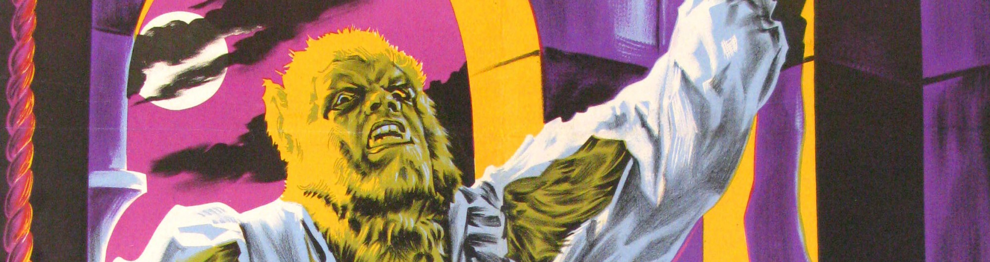
Interlight’s sleeve simply flips (and crops) the art from the original German Din-A1 poster, while Amanda’s later theatrical quad offers a rather more stylish design from Graffiti (whom we shall also meet again shortly).

Vipco’s sleeve just features a (very bloody) still of Llewelyn Thomas, which possibly influenced Mike Lee’s choice of a notably similar image for Driller Killer three months later. The British double-bill quad reconstructed above simply uses the (Suspiria-influenced) US one-sheet (with a single ‘O’ removed, as Boogey is of course what Status Quo do)

Thorn-EMI’s video sleeve is a scorchingly-memorable still, but Handmade’s earlier quad (above) must rank as just about the dullest horror poster ever (even nicking its tagline from 1979’s Prophecy).

Replay’s sleeves (unlike the films themselves) notably play it safe. Cannibal Apocalypse faithfully reproduces the Italian Due-Fogli art, but carefully crops out its gruesome punchline (of the hungry POWs sharing a snack), ironically making the weirdly truncated faces even more striking.

Replay again, and Ferox’s less commonly-seen alternate sleeve (the uncut original is, as suggested, text only). Contrary to the self-righteous blurb, this version DOES feature a graphic illustration, albeit some cartoon bones irresistibly bringing to mind the Flintstones. Ferox is Latin for ‘strong’ or ‘extreme’, and the BBFC’s informal ‘18’ cert was only awarded after nearly seven minutes of cuts. The distinctive title-logo comes from Enzo Sciotti’s original Quattro-Fogli poster.


One of the most iconic of all Nasty covers – the Daily Mail later borrowed it for their “BAN THE SADIST VIDEOS!” campaign-masthead (after first carefully blanking out Go’s logo) – this is an original British illustration by Sam Peffer (1921-2014). ‘Peff’ was born in Islington, working on 1930’s cinema front-of-house displays prior to wartime Naval service, then subsequently found his niche painting bookjackets in the ‘50s, moving into film publicity from 1971 then video packaging from summer 1979, finally retiring in Oct 1985 (the same month Putzu flew back to Rome). He worked on many of the titles under discussion, either providing finished art of his own or adapting other illustrators’ designs as required. His job-book records that Cannibal Holocaust was invoiced on 1st Feb ‘82 for £100, and thus probably represented three or four days’ work. It is unlikely the permanently-outraged Mail contributed any Royalties.


At this point we can meet two more regular contributors, Paul Brown-Constable and Nimal Jayasekera of Graffiti Productions (seen above in 1973), who studied graphic design together at the London College of Printing 1965-68 before setting up Graffiti the following year. Their studio was at 69 Beak Street in Soho and they were soon involved in the lower end of the film business, thus getting in at the very start of the video-boom (for Intervision in 1979), and quite often employing Sam Peffer when illustrations were required. As can be seen above, their sleeve for Cannibal Man just adapts the Italian Quattro-Fogli, replacing its stylish central illustration-panel with a crude (but undeniably attention-grabbing) still of a screaming victim.

Yet more cannibal excitement, this time featuring the French Grande poster in its entirety. The next film on our list – VIP’s Contamination – doesn’t appear here, as it’s a (notably grotesque) original photo-montage only, courtesy of Impressions.


The distinctive key art for Dead & Buried was reproduced unaltered across all international formats (though arguably displays best on the British quad, above). Dario Campanile was born in Rome in 1948, staying in London over 1970-71 to show his work and study English, initially supporting himself by selling his paintings at Hyde Park Corner on weekends. Back in Rome he developed his trademark surrealist sensibilities (via encouragement from none other than Salvador Dali during a stay in Cadaques) and moved to LA permanently in 1973, where the inevitable film / music-biz contacts were acquired. The photo above shows him in 1986 with his specially-commissioned 75th-anniversary version of the Paramount logo.

Vipco’s sleeve seems to be an original British illustration (with a nice portrait of Neville Brand), though the artist is currently unknown. The accompanying quad meanwhile is a straight repaint (by Ted Baldwin) of the US one-sheet design. Frustratingly little is known about Baldwin, other than that he came from Reading and worked regularly for both Alan Wheatley and Mike Wheeler, the twin guvnors of 1970s indie-film publicity. Baldwin rarely signed his work (Death Trap is a notable exception), though his loose, splashy style is fairly distinctive and we shall encounter another likely example of it shortly. Just to add to the confusion, his poster-art DID in fact briefly appear on an even earlier Death Trap tape – VCL had released a heavily-cut version of the film back in 1980. boxed in a cardboard slip-case which featured a tight crop of the quad illustration. But (unlike Vipco’s later uncut extravaganza) this milder version was never prosecuted, so is not reproduced here.

This Derann cover seems to be an original piece of British art, which looks to be by the same (somewhat gauche) illustrator as their companion-sleeve for Don’t Look in the Basement – his distinctive work also appears on a few rival labels of the period, including Wordwide Video’s 1983 release of Pete Walker’s Man of Violence. The optimistically-appended ‘X’ cert here is completely spurious, as the film was flatly rejected by the BBFC in Sept 1975.

This is the less commonly-seen alternate VTC sleeve for Delirium (the better-known version is a dull photo-montage) which utilises the lively US one-sheet art.

Here we have a real obscurity: the little-seen Spanish pre-production art for yet another Jess Franco cannibal extravaganza (under its original ‘Man Hunter’ title) – the example shown is from a May 1980 copy of Variety, alerting potential international distributors. Note that the staked (and voluptuous) heroine is inexplicably missing from Cinehollywood’s sleeve, replaced by hastily daubed-in foliage.

Videospace’s sleeve for the first of our four ‘Don’t!’ titles is yet another dreary photo (check out Bryce’s earlier book-link if you insist on looking at it). The quad in contrast utilises the far more stylish US one-sheet art, here supporting a reissue of the ever-popular Phantasm (featuring a classic Joe Smith illustration).

Similar to their earlier-seen Axe, this Video Network sleeve just reproduces the US one-sheet intact, again including its redundant ‘R’ certificate. So – assuming you aren’t already too terrified to continue – let’s now move on to our next spine-tingling selection of witless tat…..